A design system for Sixhands — a Japanese-Australian salad bar in Singapore. Warm, hand-made, a little cheeky. These tokens, components and characters keep our consumer app fun and gamified — and our admin app focused and clean.
Consumer appiOS · Android · 428×926
Admin appTablet · Desktop · 834×1194+
TypeNohemi · Inter · Damion
Core paletteForest · Cream · Lime
Consumer
Order, collect, gift.
A playful loyalty app with mascots, stamps and gifting. Warm cream backgrounds, round shapes, rewarding micro-interactions.
Admin
Run the bar, calmly.
A focused operator tool for staff and managers. Dense data, predictable tables, reduced chrome — same brand, lower volume.
01
Brand
Logo, wordmark, voice. A Japanese-Australian salad bar — hand-made feel, a little cheeky, always warm.
sixhands
Japanese · Australian · Salad
Min clearance: 1× bowl widthMin size: 32px digital
Voice
Warm, direct, a little playful. Written like a friend at the counter. No corporate filler, no exclamation-mark overload — but earned warmth.
✓ What are you having today?
Welcome to our menu page.
✓ You've been gone a while.
You have not logged in for 30 days.
✓ Nice, earned 10 points.
Congratulations! You have received 10 points!!
✓ Top-up
Reload your wallet now
02
Color
A grounded palette: forest green for authority, cream for warmth, lime for energy. Muted supporting tones keep admin surfaces calm.
Brand · core
Forest
Forest
#006A56 · rgb(0,106,86)
--forest · --brand
Forest Deep
Forest Deep
#05352C
--forest-deep · --text
Lime
Lime
#CEF580
--lime · --accent
Cream
Cream
#FFF9ED
--cream · --bg
Butter
Butter
#FFE8BB
--butter
Support · warm & muted
Sage
Sage
#B3D2CC
--sage
Moss
Moss
#829A95
--moss · --text-dim
Cream 2
Cream 2
#F6EDDB
--cream-2
Apricot
Apricot
#F7E4B8
--apricot
Honey
Honey
#FCF4D1
--honey
Blush
Blush
#FF9CA9
--blush
System · feedback
Alert
Alert
#F2240D
--alert
Info
Info
#0D4088
--info
Info · bg
Info Subtle
#E9EEF4
--info-bg
Ink
Ink
#1E1E1E
--ink
Usage — Consumer
Cream backgrounds, butter warm zones for hero content, forest for CTAs and headings. Lime only for contrast inside forest CTAs, and for small delight accents. Blush is reserved for character work.
Usage — Admin
Cream background retained for brand continuity. Forest used sparingly — table headers, active nav, primary actions. Avoid butter/blush in data-heavy views; prefer cream-2 for striping.
03
Type
Nohemi for warmth and personality. Inter for UI precision. Damion as a rare scripted accent for brand moments only.
Display XL Display
What are you having today?
Nohemi · 700
72/69 px
track -0.02em
Display L Marketing
Fresh hands, fresh bowls.
Nohemi · 700
48/50 px
track -0.015em
H1 Screen title
Customers
Nohemi · 700
40/44 px
H2 Section
Recently Ordered
Nohemi · 700
32/35 px
H3 Subsection
Your loyalty points
Nohemi · 700
24/29 px
Title Card title
Wallet
Nohemi · 700
20/24 px
Body large Emphasis
I assumed you were busy conquering something.
Nohemi · 400
18/26 px
Body Default
No orders yet — start ordering and we'll remember your favourites for next time.
Nohemi · 400
16/24 px
Body UI Admin body
Displays, forms and tables in the admin app use Inter for density and legibility at small sizes.
Inter · 500
15/22 px
Caption Helper / meta
Last updated 2 minutes ago
Nohemi · 400
14/20 px
Label Chip / tag
Eyebrow Label
Inter · 700
12px · track .14em · UPPER
Script Accent only
hands
Damion · 400
Reserved for wordmark
and hero accents only
04
Spacing · Radii · Shadows
Generous, round, quiet. Round corners are our strongest shape signature — everything from pills to cards.
Spacing scale · 4pt
4s-1
8s-2
12s-3
16s-4
20s-5
24s-6
32s-7
40s-8
48s-9
64s-10
Radii
0 · flat
8 · sm
12 · md
20 · lg
28 · xl
pill
Elevation
sm · hairline
md · card
lg · modal
menu · bottom nav
Elevation is subtle — we rely on color and round shapes to separate surfaces, not drop-shadow stacks.
05
Consumer components
Components for the mobile app. Round, tactile, generous padding. Inspired by the hand-built diner feel.
Buttons · Primary
Buttons · Secondary
Buttons · Ghost & Text
Input fields
We'll only email you about rewards.
Looks like that number's incomplete.
Filter chips
AllBowlsSidesDrinks
Checkboxes
✓✓
Try it — live
Hover, focus, and press the components below to feel the real transitions. Static states above stay as reference.
:hover · :focus · :active
Buttons
Primary lifts on hover, dips on press. Try keyboard Tab.
Inputs — focus ring
Filter chips — toggle
AllBowlsSidesDrinksSweets
Checkboxes — toggle
✓✓
Click to toggle · tick snaps in with a scale bounce.
Points & rewards
999.99
Points
History
5
Gifts
View all
🥗
Free poke bowl
Expires in 3 days
120 pts
Nudge banner
You've been gone a while.
I assumed you were busy conquering something.
Close
Bottom navigation
5 tabs · cream surface · subtle top-shadow lift.
Composition · Home screen
@sharmaine
What are you having today?
Order now→
999
Points
5
Gifts
Consumer home — anatomy
A warm cream canvas with a butter blob behind the hero. Mascot character anchors order entry; points and gifts sit directly beneath as tappable pill stats. Bottom nav floats on a raised cream surface for thumb reach.
Username in Nohemi 18 · forest
Hero H1 in Nohemi 32 · forest · max 3 lines
Character card 18px radius · butter fill
Pill CTA on every hero card (forest + lime)
06
Admin components
Tablet & desktop. Brand is quieter: less color, more density. Inter leads, Nohemi is used only for page-title and brand moments.
Customers
Search customers
Customer ID
Name
Points
Orders
Status
Member since
SH-1028
Sharmaine Low
1,240
38
Active
Jan 2024
SH-1029
Marcus Yeo
840
22
Active
Mar 2024
SH-1030
Priya Nair
110
4
Dormant
Aug 2024
SH-1031
Hiro Tanaka
0
0
Blocked
Feb 2025
SH-1032
Aisha Rahman
512
14
Active
Oct 2024
Previous
12345…10
Next →
Admin retains the brand's cream canvas + forest sidebar. Data surfaces use white with cream-2 striping and forest headers for scannability.
07
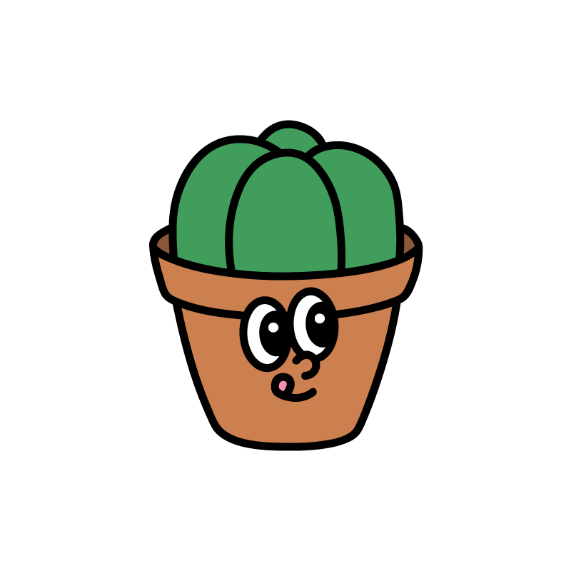
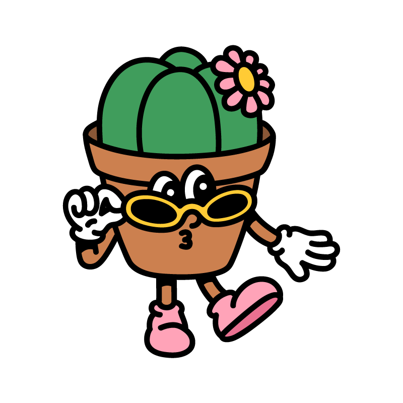
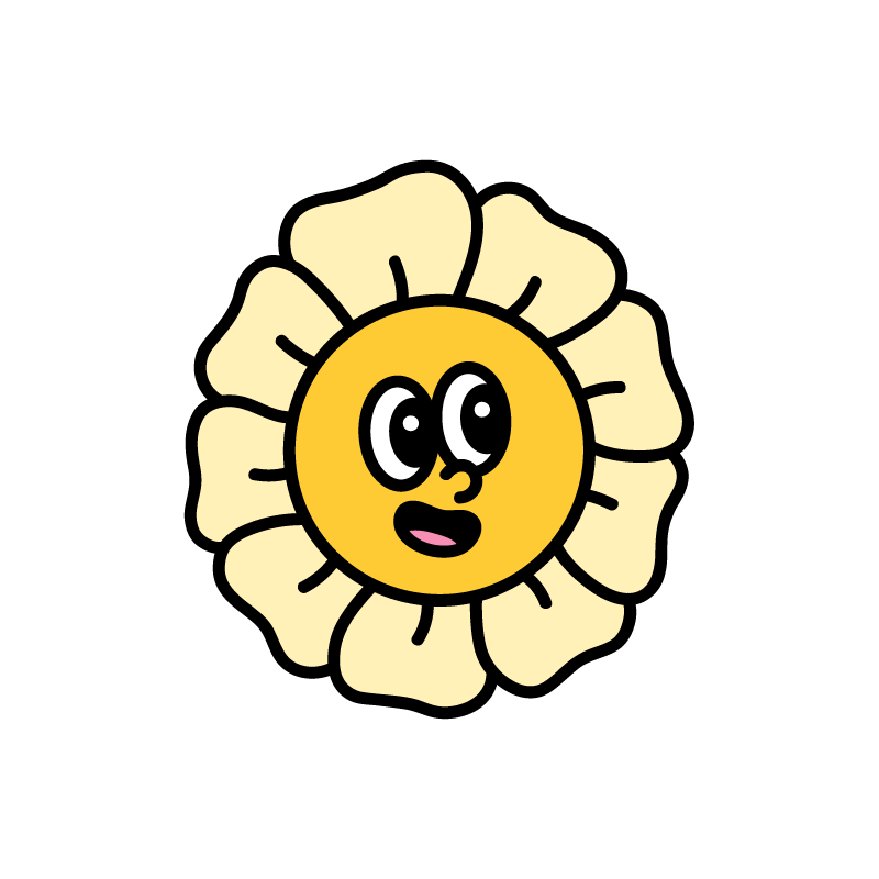
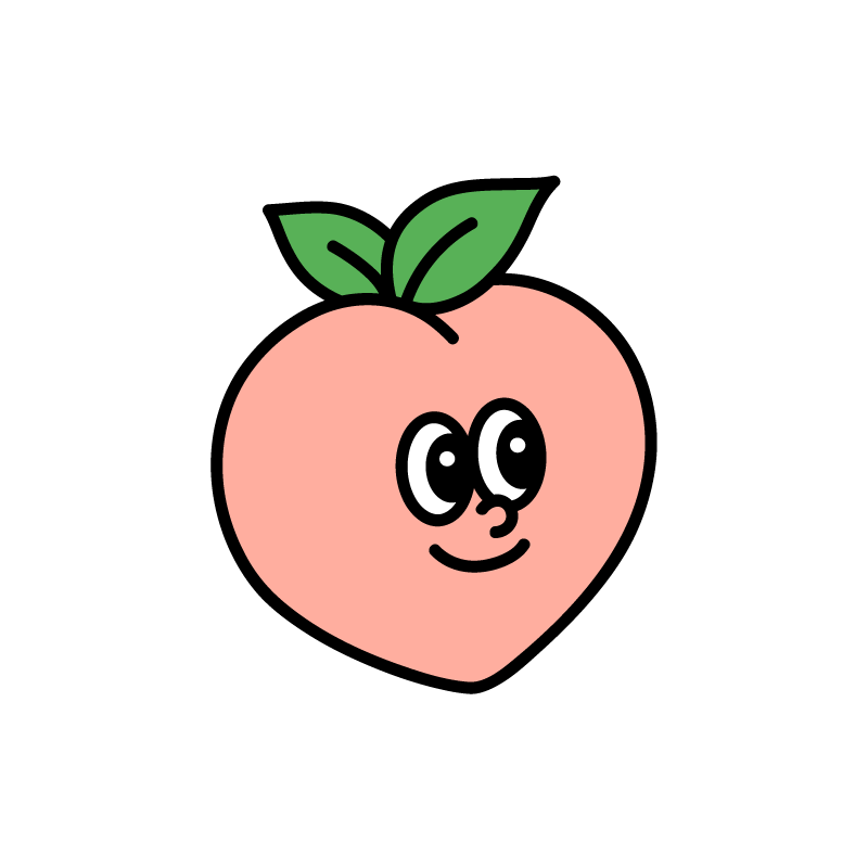
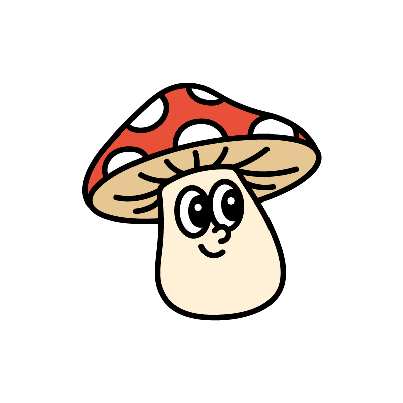
Characters
Eight mascots, one family. Heavy 6px black line, flat fills, soft-retro smile. Used as avatars, empty-states and delight moments. Consumer-only.
Cactus
Egg
Ghost
Flower
Heart
Ice-cream
Peach
Mushroom
Usage
Selected at sign-up as the user's avatar
Each mascot has 4 expressions (1–4) for states & reactions
Hero slot on home; avatar spot in menu + friends
Never alter the outline weight or recolor outside brand palette
Don't
Don't stretch, skew or rotate the mascots
Don't place on patterned backgrounds — always solid cream, butter, or sage
Don't use in admin surfaces (keep operator tools calm)
Don't mix with other illustration systems
08
Iconography
24×24 grid, 1.8px stroke, rounded joints. Forest deep for default, forest for active, moss for inactive. Filled variants reserved for bottom-nav active state.
Home
Profile
Friends
Cart
Gift
Rewards
Bell
Search
Favorite
Clock
Pin
Delete
Arrow
Plus
Close
Menu
Sixhands design system · v1.0 · built from Figma source